Code
library(tidyverse)
library(lubridate)

library(ggrepel)
library(dagitty)
library(tsibble)

library(scales)
theme_set(theme_light())library(tidyverse)
library(lubridate)
library(ggrepel)
library(dagitty)
library(tsibble)
library(scales)
theme_set(theme_light())Seiji Kojima, Professor Emeritus of Nagoya University, suggests that the repeated vaccine shots, like the third or the fourth shots, may cause more excess mortality in the article of Shukan Shincho (December 22, 2022). He shows the chart like below, and asserts there is a correlation between additional shots in 2022 and excess deaths in the summer of 2022. The chart below is not the same with the chart in the article, but looks similar enough, I think.
excess_mortality_economist_estimates <- read_csv("https://github.com/owid/covid-19-data/raw/master/public/data/excess_mortality/excess_mortality_economist_estimates.csv")

vaccinations <- read_csv("https://github.com/owid/covid-19-data/raw/master/public/data/vaccinations/vaccinations.csv")excess_deaths_summer_2022 <- excess_mortality_economist_estimates %>%
filter(date >= "2022-08-01", date <= "2022-10-24") %>%
group_by(country) %>%
summarize(excess_deaths = (cumulative_estimated_daily_excess_deaths_per_100k[which.max(date)] - cumulative_estimated_daily_excess_deaths_per_100k[which.min(date)]) * 10) %>%
ungroup()
excess_deaths_upto_spring_2022 <- excess_mortality_economist_estimates %>%
filter(date <= "2022-07-31") %>%
group_by(country) %>%
summarize(excess_deaths = (cumulative_estimated_daily_excess_deaths_per_100k[which.max(date)] - cumulative_estimated_daily_excess_deaths_per_100k[which.min(date)]) * 10) %>%
ungroup()shots_2022 <- vaccinations %>%
filter(date >= "2022-01-01", date <= "2022-11-01") %>%
group_by(location) %>%
summarize(shots = max(total_vaccinations_per_hundred, na.rm = TRUE) - min(total_vaccinations_per_hundred, na.rm = TRUE)) %>%
ungroup()
shots_upto_2021 <- vaccinations %>%
filter(date <= "2021-12-31") %>%
group_by(location) %>%
summarize(shots = max(total_vaccinations_per_hundred, na.rm = TRUE) - min(total_vaccinations_per_hundred, na.rm = TRUE)) %>%
ungroup()picked <- c("Japan", "Taiwan", "Vietnam", "Germany", "Belgium",
"South Korea", "United Kingdom", "Spain", "Singapore",
"Albania", "Croatia", "Bosnia and Herzegovina",
"Pakistan","Bulgaria", "Indonesia", "Jordan")
excess_deaths_shots <- excess_deaths_summer_2022 %>%
filter(country != "World") %>%
inner_join(shots_2022, by = c( "country" = "location")) %>%
mutate(label = if_else(country %in% picked, country, NA))
excess_deaths_shots %>%
filter(!is.na(label)) %>% # cherry-picked 16 countries
ggplot(aes(shots, excess_deaths)) +
geom_point() +
geom_smooth(method = "lm") +
geom_text_repel(aes(label = label)) +
labs(x = "Vaccine shots per 100 persons, from 2022-01-01 to 2022-11-01",
y = "Excess deaths per 1 million persons,\nfrom 2022-08-01 to 2022-10-24",
caption = "Note: Excess deaths are estimated by the Economist\nSource: Our World In Data")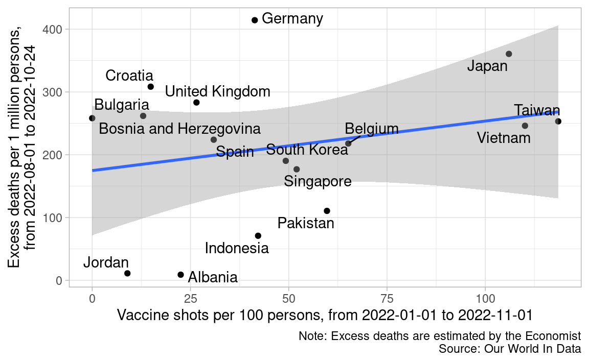
Although the chart above plots only 16 areas, there are 214 areas in the data. So, I plot all 214 areas in the chart below. Now, there is no apparent correlation between shots in 2022 and excess mortality in the summer of 2022.
excess_deaths_shots %>% # 214 countries
  mutate(cherrypicked = if_else(!is.na(label), "Yes", "No")) %>%
  ggplot(aes(shots, excess_deaths)) +
  geom_point(aes(color = cherrypicked)) +
  geom_smooth(method = "lm") +
  geom_text_repel(aes(label = country)) +
  scale_color_manual(values = c("gray60", "red")) +
  labs(x = "Vaccine shots per 100 persons, from 2022-01-01 to 2022-11-01",
       y = "Excess deaths per 1 million persons,\nfrom 2022-08-01 to 2022-10-24",
       caption = "Note: Excess deaths are estimated by the Economist\nSource: Our World In Data",
       color = "Cherry-picked") +
  theme(legend.position = "top")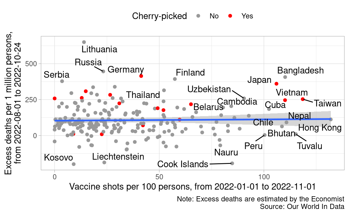
He may have thought Bangladesh, Cuba, Nepal, etc. can’t be the repeated shots, and excluded them. However, even if there is some legitimate reasons to pick up his 16 areas, there is not necessarily a causal path from A (additional vaccine shots) to E (excess mortality in the summer of 2022). Below, I show S (vaccine shots up to the end of 2021) can be a confound.
E: Excess mortality in the summer of 2022
C: Cumulative extra mortality up to the spring of 2022
S: Vaccine shots up to the end of 2021
A: Additional vaccine shots in 2022
dag_con <- dagitty("dag{
                  A <- S -> C -> E
                  }")
coordinates(dag_con) <- list(x = c(A = 0, S = 0, C = 1, E = 1),
                               y = c(A = 1, S = 0, C = 0, E = 1))
rethinking::drawdag(dag_con)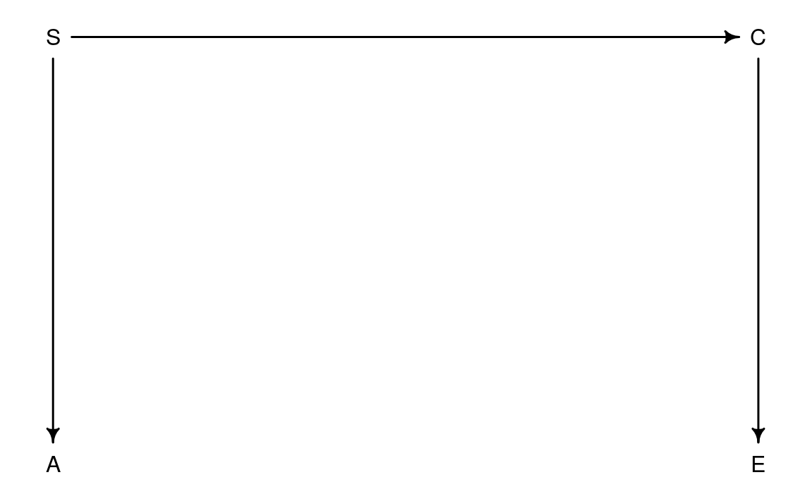
S -> C: Eager shooters could reduce excess mortality up to the spring of 2022.
excess_deaths_shots_2021 <- excess_deaths_upto_spring_2022 %>%
  filter(country != "World") %>%
  inner_join(shots_upto_2021, by = c( "country" = "location")) %>%
  mutate(label = if_else(country %in% picked, country, NA))

excess_deaths_shots_2021 %>%
  filter(!is.na(label)) %>% # cherry-picked 16 countries
  ggplot(aes(shots, excess_deaths)) +
  geom_point() +
  geom_smooth(method = "lm") +
  geom_text_repel(aes(label = label)) +
  scale_y_continuous(labels = comma) +
  labs(x = "Vaccine shots per 100 persons, up to 2021-12-31",
       y = "Excess deaths per 1 million persons,\nfrom 2020-01-01 to 2022-07-31",
       caption = "Note: Excess deaths are estimated by the Economist\nSource: Our World In Data")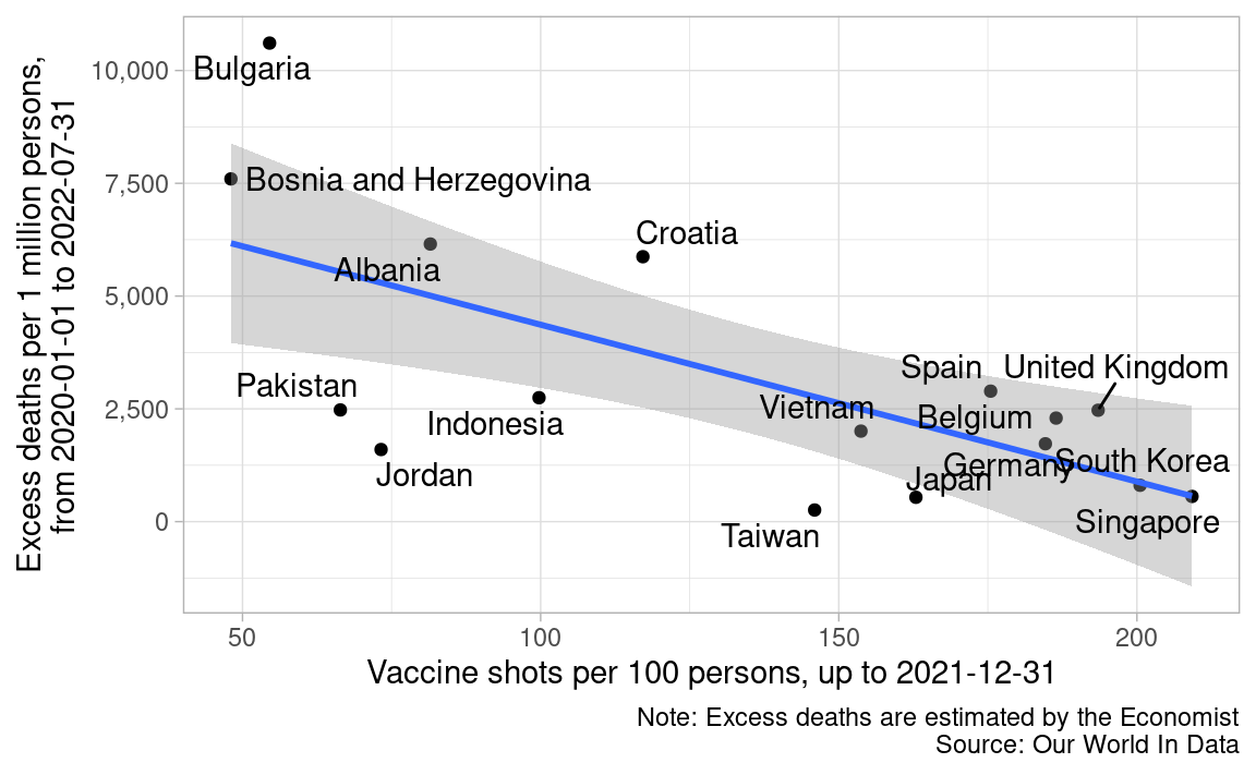
C -> E: So, the vulnerable people, who could survive up to the spring of 2022, remain vulnerable in the summer of 2022.
excess_deaths_shots %>%
  filter(!is.na(label)) %>%
  bind_cols(
    excess_deaths_shots_2021 %>%
      filter(!is.na(label)) %>%
      select(excess_deaths_upto_spring_2022 = excess_deaths,
             shots_upto_2021 = shots)
  ) %>%
  select(-label) %>%
  ggplot(aes(excess_deaths_upto_spring_2022, excess_deaths)) +
  geom_point() +
  geom_smooth(method = "lm") +
  geom_text_repel(aes(label = country)) +
  scale_x_continuous(labels = comma) +
  labs(x = "From 2020-01-01 to 2022-07-31",
       y = "From 2022-08-01 to 2022-10-24",
       title = "Excess deaths per 1 million persons",
       caption = "Note: Excess deaths are estimated by the Economist\nSource: Our World In Data")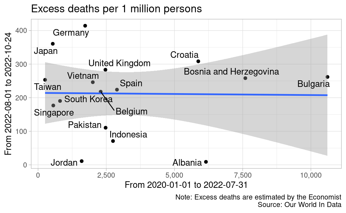
S -> A: Eager shooters tend to continue to shoot.
shots_2022 %>%
  filter(location %in% picked) %>%
  bind_cols(
    shots_upto_2021 %>%
  filter(location %in% picked) %>%
    select(-location, shots_upto_2021 = shots)
  ) %>%
  ggplot(aes(shots_upto_2021, shots)) +
  geom_point() +
  geom_smooth(method = "lm") +
  geom_text_repel(aes(label = location)) +
  labs(x = "Up to 2021-12-31",
       y = "From 2022-01-01 to 2022-11-01",
       title = "Vaccine shots per 100 persons",
       caption = "Source: Our World In Data")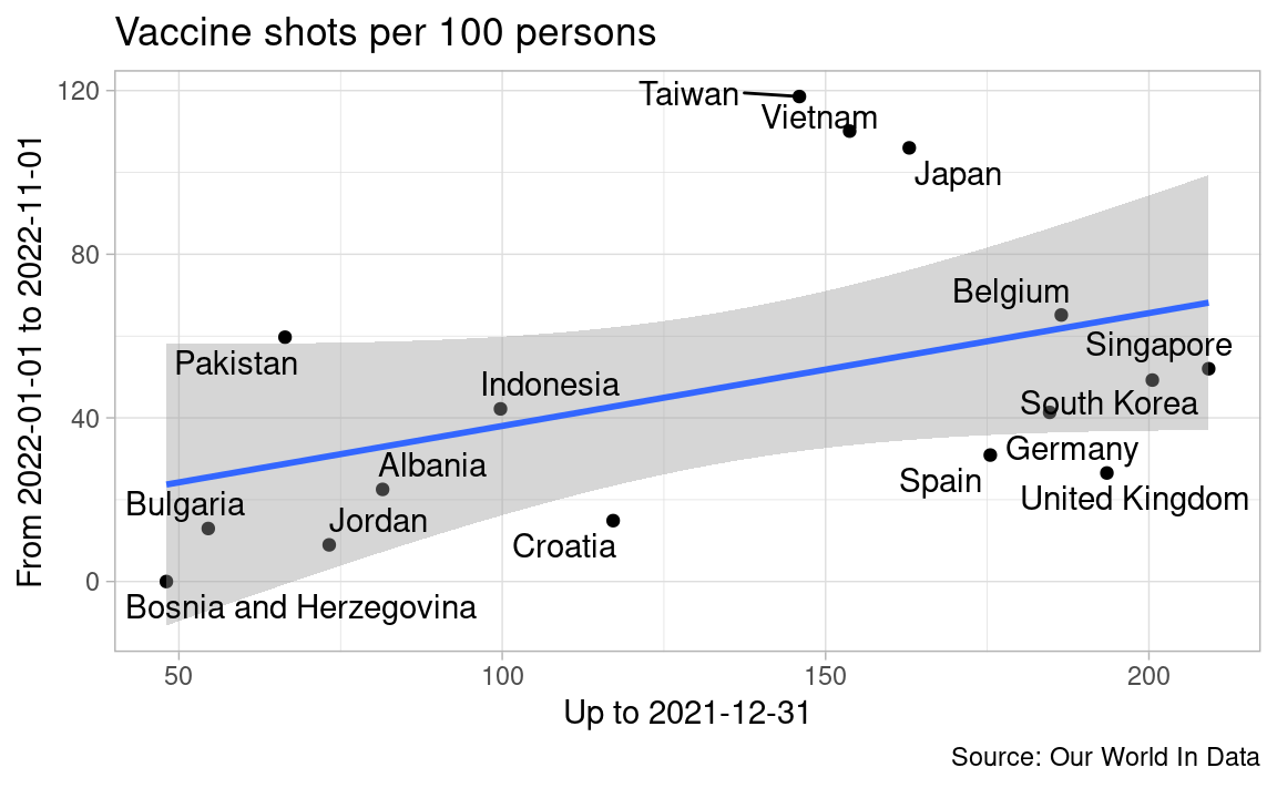
vaccine_jp <- read_csv("https://data.vrs.digital.go.jp/vaccination/opendata/latest/summary_by_date.csv")
vaccine_jp_ratio <- vaccine_jp %>%
select(date:count_fifth_shot_general) %>%
mutate(across(-date, ~ cumsum(.x) / 125918711)) %>%
pivot_longer(-date, names_to = "order", values_to = "shots") %>%
mutate(order = str_remove_all(order, "count_|_shot|_general")) %>%
filter(shots != 0) %>%
mutate(
order = factor(order,
levels = c("first", "second", "third", "fourth", "fifth"),
labels = c("1st", "2nd", "3rd", "4th", "5th"))
)
covid_deaths_jp <- read_csv("https://covid19.mhlw.go.jp/public/opendata/deaths_cumulative_daily.csv")%>%
mutate(Date = as.Date(Date)) %>%
select(date = Date, deaths = ALL)
economist_estimates_jp <- excess_mortality_economist_estimates %>%
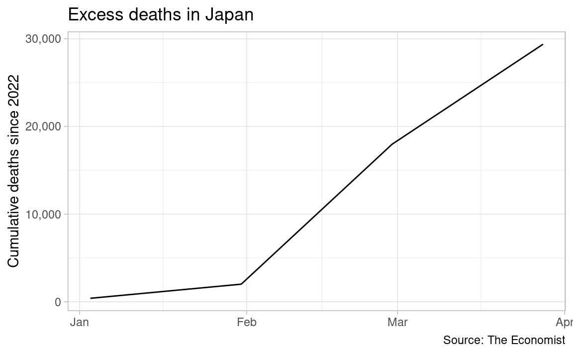
filter(country == "Japan")Shukan Shincho continues to suggest causation from repeated vaccine shots to excess deaths in 3 weeks in a row, by showing Professor Kojima’s line chart like below. Prof Kojima warns against repeated vaccine shots by suggesting there is a synchronized movement between 3rd vaccine shots and cumulative excess deaths from January to March 2022. However, his warning does not sound persuasive, because it assumes immediate effects of vaccine shots on deaths, and it depends on just 3 months data.
vaccine_jp_ratio %>%
  filter(order == "3rd", date >= "2022-01-01", date < "2022-04-01") %>%
  ggplot(aes(date, shots)) +
  geom_line() +
  scale_y_continuous(labels = percent) +
  labs(x = NULL, y = "Cululative shots per population",
       color = "Order of shots",
       title = "3rd vaccine shots in Japan",
       caption = "Source: Digital Agency")

cum_end_of_2021 <- economist_estimates_jp %>%
  filter(date == "2021-12-27") %>%
  pull(cumulative_estimated_daily_excess_deaths)

economist_estimates_jp %>%
  filter(date >= "2022-01-01", date < "2022-04-01") %>%
  mutate(excess_deaths_2022 = cumulative_estimated_daily_excess_deaths - cum_end_of_2021) %>%
  ggplot(aes(date, excess_deaths_2022)) +
  geom_line() +
  scale_y_continuous(labels = comma) +
  labs(x = NULL, y = "Cumulative deaths since 2022",
       title = "Excess deaths in Japan",
       caption = "Source: The Economist")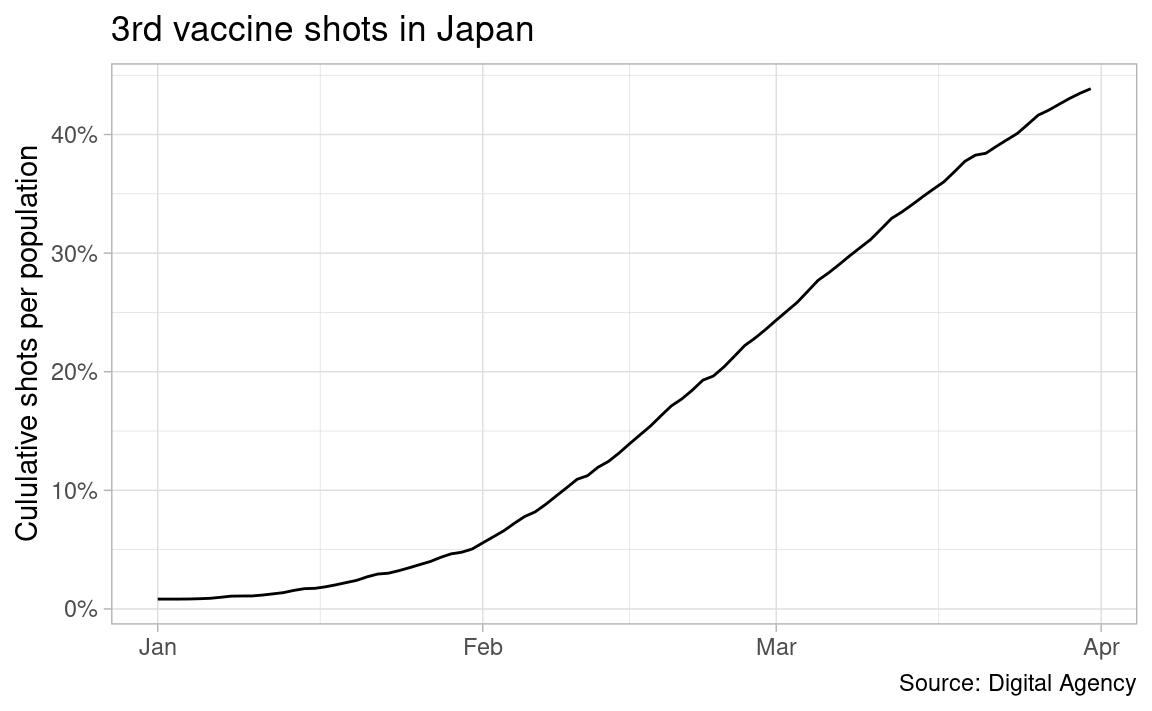
When we broaden the time horizon, it is hard to notice synchronized movement between vaccine shots and cumulative excess deaths. Instead, we notice continuous excess deaths rise over Covid-19 deaths in 2022.
vaccine_jp_ratio %>%
ggplot(aes(date, shots)) +
geom_line(aes(color = order)) +
scale_y_continuous(labels = percent) +
scale_color_brewer(palette = "Dark2") +
labs(x = NULL, y = "Cululative shots per population",
color = NULL,
title = "Vaccine shots in Japan",
caption = "Source: Digital Agency") +
theme(legend.position = "bottom")
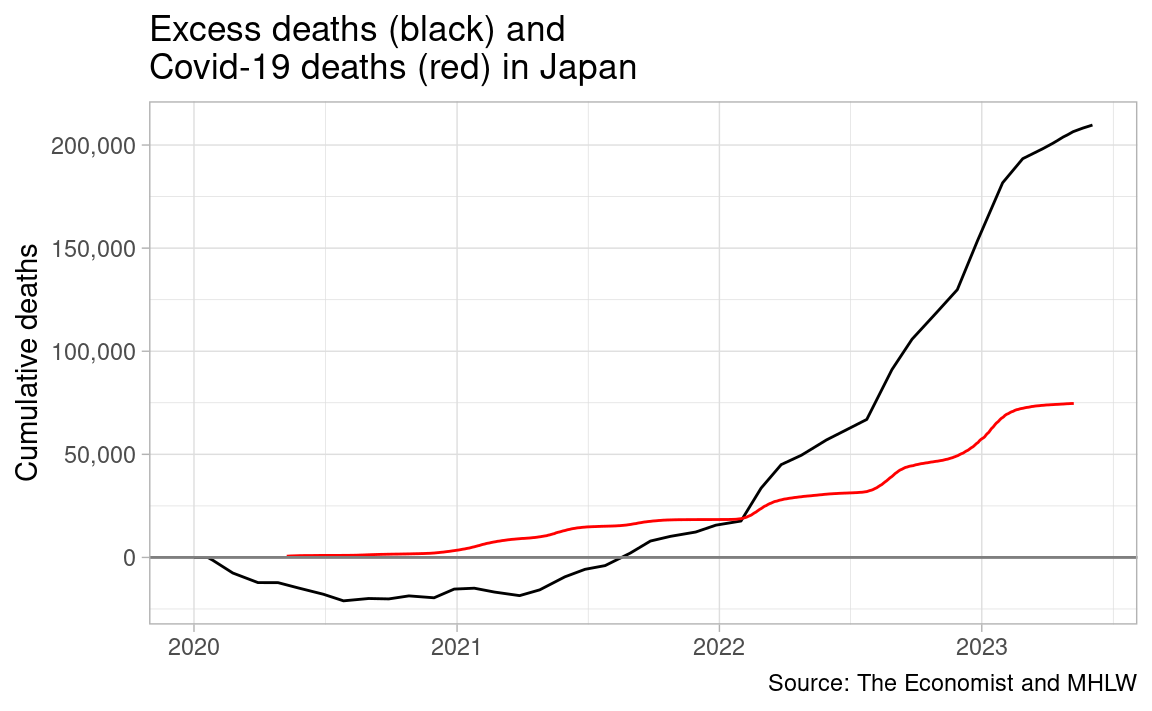
economist_estimates_jp %>%
ggplot(aes(date, cumulative_estimated_daily_excess_deaths)) +
geom_line() +
geom_line(aes(date, deaths), data = covid_deaths_jp, color = "red") +
geom_hline(yintercept = 0, color = "gray50") +
scale_y_continuous(labels = comma) +
labs(x = NULL, y = "Cumulative deaths",
title = "Excess deaths (black) and\nCovid-19 deaths (red) in Japan",
caption = "Source: The Economist and MHLW")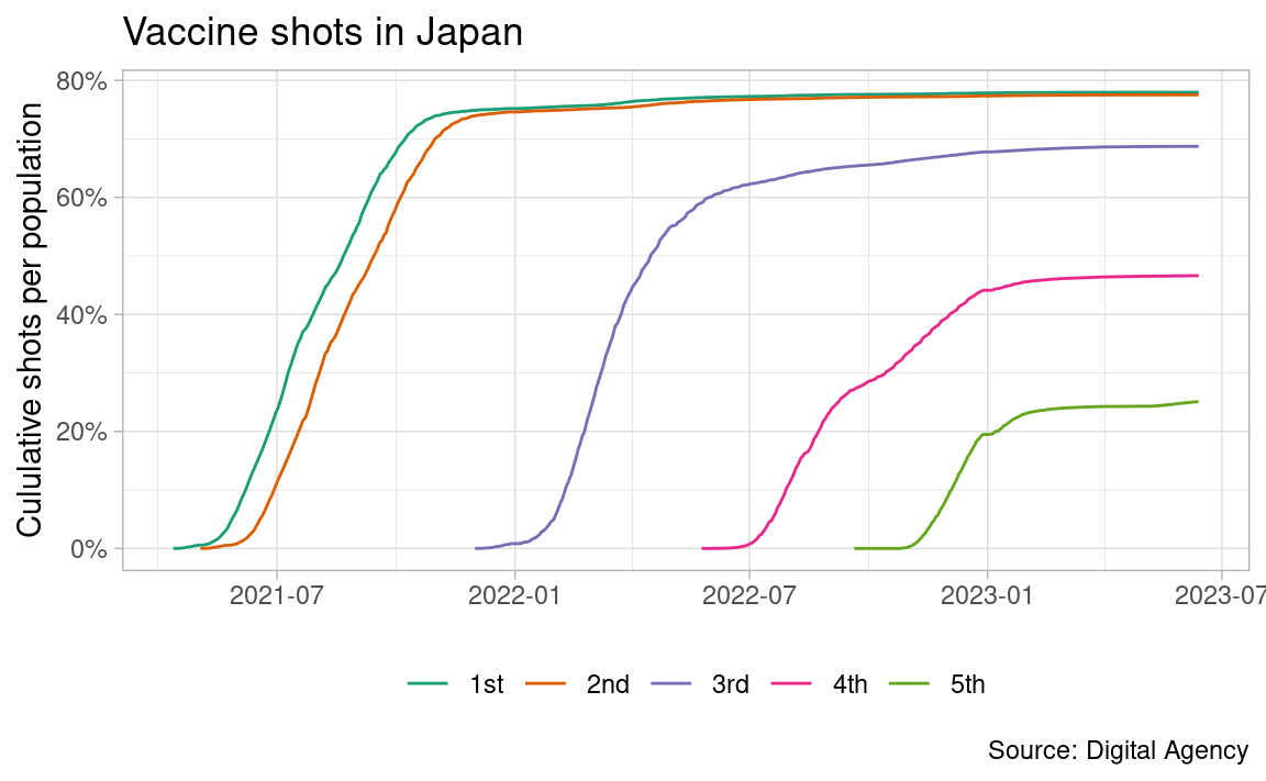
excess_mortality <- read_csv("https://github.com/owid/covid-19-data/raw/master/public/data/excess_mortality/excess_mortality.csv")

excess_mortality_jp <- excess_mortality %>%
  filter(location == "Japan")
There are two estimates of excess deaths by The Economist and by World Mortality Dataset (WMD). So far I use the Economist, which estimates more excess deaths than WMD.
bind_rows(
  economist_estimates_jp %>%
  select(date, cum_excess = cumulative_estimated_daily_excess_deaths) %>%
  mutate(source = "The Economist"),
excess_mortality_jp %>%
  select(date, cum_excess = cum_excess_proj_all_ages) %>%
  mutate(source = "WMD")
) %>%
  ggplot(aes(date, cum_excess)) +
  geom_line(aes(color = source)) +
  geom_hline(yintercept = 0, color = "gray50") +
  scale_y_continuous(labels = comma) +
  labs(x = NULL, y = "Cumulative excess deaths",
       color = "Source",
       title = "The Economist estimates more excess deaths than WMD",
       caption = "Source: Our World In Data")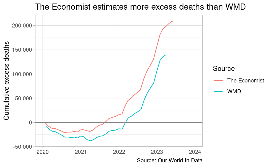
Excess deaths are actual deaths minus projected deaths. It turns out projected deaths from 2020 are linear extrapolation from 2015-2019 deaths in World Mortality Dataset (WMD) which Our World In Data uses.
“Before 20 September 2021, we calculated P-scores using a different estimate of expected deaths: the five-year average from 2015–2019. We made this change because using the five-year average has an important limitation — it does not account for year-to-year trends in mortality and thus can misestimate excess mortality. The WMD projection we now use, on the other hand, does not suffer from this limitation because it accounts for these year-to-year trends.”
The Economist claims it uses a model to estimate excess deaths. As its estimates are larger than WMD in Japan, it is likely that the Economist does not age-adjust normal deaths projection either.
As projection is not age-adjusted, it is more plausible that projection is too low than that actual deaths are too high in 2022.
seasonality <- excess_mortality_jp %>%
  filter(!is.na(average_deaths_2015_2019_all_ages)) %>%
  mutate(month = month(date)) %>%
  select(month, average_deaths_2015_2019_all_ages) %>%
  mutate(seasonality = average_deaths_2015_2019_all_ages - mean(average_deaths_2015_2019_all_ages)) %>%
  select(month, seasonality)

actual_2015_2019 <- excess_mortality_jp %>%
  filter(!is.na(deaths_2015_all_ages)) %>%
  select(date, deaths_2015_all_ages:deaths_2019_all_ages) %>%
  pivot_longer(-date, names_to = "year", values_to = "actual") %>%
  mutate(
    month = month(date),
    year = year %>%
      str_sub(8, 11) %>%
      as.integer()
    ) %>%
  select(-date) %>%
  left_join(seasonality, by = "month") %>%
  mutate(
    actual_sa = actual - seasonality,
    date = make_yearmonth(year, month)
    ) %>%
  select(-year, -month) %>%
  arrange(date)

actual_since_2020 <- excess_mortality_jp %>%
  filter(!is.na(deaths_since_2020_all_ages)) %>%
  select(date, actual = deaths_since_2020_all_ages) %>%
  mutate(month = month(date)) %>%
  left_join(seasonality, by = "month") %>%
  mutate(
    actual_sa = actual - seasonality,
    date = yearmonth(date)
    ) %>%
  select(-month)

projected_since_2020 <- excess_mortality_jp %>%
  filter(!is.na(projected_deaths_since_2020_all_ages)) %>%
  select(date, projected = projected_deaths_since_2020_all_ages) %>%
  mutate(month = month(date)) %>%
  left_join(seasonality, by = "month") %>%
  mutate(
    projected_sa = projected - seasonality,
    date = yearmonth(date)
    ) %>%
  select(-month)

bind_rows(actual_2015_2019, actual_since_2020) %>%
  ggplot(aes(date, actual_sa)) +
  geom_line() +
  geom_line(aes(date, projected_sa), data = projected_since_2020,
            color = "blue", linewidth = 0.8) +
  geom_smooth(method = "lm", data = actual_2015_2019, se = FALSE) +
  scale_y_continuous(labels = comma) +
  labs(x = NULL, y = "Monthly deaths in Japan\nseasonally adjusted\nby using 2015-2019 average additively",
     title = "Actual deaths surpass projection in 2022",
     subtitle = "Black is actual, and blue is projection; linear extrapolation from 2015-2019",
     caption = "Note: Excess deaths are estimated by WMD\nSource: Our World In Data")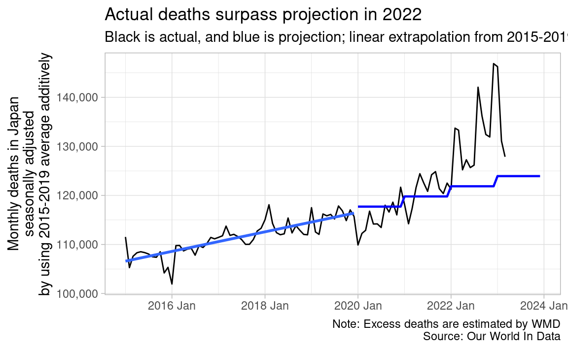
Projection by WMD is age-adjusted in below 35 locations. In other locations, including Japan, projection is not age-adjusted, and just linear extrapolation of total deaths in 2015-2019.
excess_mortality %>%
  filter(!is.na(p_scores_15_64)) %>%
  distinct(location) %>%
  pull(location)
[1] "Australia" "Austria" "Belgium" "Bulgaria"
[5] "Canada" "Chile" "Croatia" "Czechia"
[9] "Denmark" "England & Wales" "Estonia" "Finland"
[13] "France" "Germany" "Greece" "Hungary"
[17] "Iceland" "Israel" "Italy" "Latvia"
[21] "Lithuania" "Luxembourg" "Netherlands" "New Zealand"
[25] "Northern Ireland" "Norway" "Poland" "Portugal"
[29] "Scotland" "Slovakia" "Slovenia" "South Korea"
[33] "Spain" "Switzerland" "United Kingdom" "United States" The oldest baby boomers in Japan were born in 1947, two years after the end of World War II. They were 70 years old in 2017, and 75 years old in 2022. And 75-79 person death rates are 1.66 times of 70-74 person in 2019, according to Ministry of Health, Labour and Welfare (Japanese, PDF). I don’t have enough data to make age-adjusted projection by myself, but I can safely say that not age-adjusted projection is too low.