Code
library(tidyverse)
library(ggrepel)

theme_set(theme_light())library(tidyverse)
library(ggrepel)
theme_set(theme_light())Prof Hiroaki Miyamoto of Tokyo Metropolitan University asserts that long employee tenure lowers productivity growth, thus hurts wage growth, and proposes measures to promote job changes by workers in his “Lecture on Economics” in Nikkei news paper on Februay 5, 2024 (Japanese).
To justify his claim, he draws a scatter plot of 14 countries, of which x-axis is employee tenure, and y-axis is wage growth, but he fails to state why he chooses these 14 countries, what year the data denote, whether wage is nominal or real, or what the data source is.
I find this table of employee tenure in 2020 shows the same 14 country data in the site of the Japan Institute for Labour Policy and Training.
# 14 countries
target_countries <- c("JPN", "USA", "GBR", "DEU", "FRA", "ITA", "NLD", "BEL", "DNK", "SWE", "FIN", "NOR", "ESP", "KOR")

employee_tenure <- tibble(
  ref_area = target_countries,
  tenure_total = c(11.9, 4.1, 8.1, 10.8, 11.0, 12.4, 9.4, 10.9, 7.2, 8.3, 8.8, 8.6, 10.5, 6.0),
  tenure_55_64 = c(19.1, 9.9, 13.9, 19.5, 21.1, 21.3, 18.9, 21.4, 14.0, 16.6, 17.9, 16.9, 20.1, 8.1)
)
As the difference in wage growth is small between the US and the UK, I guess wage is nominal, and find this table of wages in 2020 in the same site. However, I fail to find wages in the past. So, I download wage data from ILO stat, where I search indicator catalogue and find wage data id.
dat_monthly <- Rilostat::get_ilostat(id = "EAR_4MTH_SEX_ECO_CUR_NB_A")Table EAR_4MTH_SEX_ECO_CUR_NB_A cached at /tmp/Rtmpb5FT0t/ilostat/indicator-EAR_4MTH_SEX_ECO_CUR_NB_A-code-raw-20240204T0718.rdsJudging from the data availability, and some data discontinuity in the UK and Germany I find in the ILO stat, I set y-axis from 2009 to 2018, not in manufacturing but in total. As a result, y-axis scale is nearly half of the original plot in Nikkei news paper. However, an apparent negative relationship can be observed as well.
dat_monthly2 <- dat_monthly |>
  filter(
    ref_area %in% target_countries,
    sex == "SEX_T",
    classif1 == "ECO_AGGREGATE_TOTAL",
    classif2 == "CUR_TYPE_LCU",
    time %in% c(2009, 2018)
  ) |>
  select(ref_area, time, obs_value) |>
  pivot_wider(names_from = time, values_from = obs_value) |>
  mutate(
    country = countrycode::countrycode(ref_area, origin = "iso3c", destination = "country.name"),
    growth = `2018` / `2009` - 1
    ) |>
  left_join(employee_tenure, by = "ref_area")

draw_scatterplot <- function(df, x, y){
  df |>
    ggplot(aes({{x}}, {{y}})) +
    geom_smooth(method = "lm", se = TRUE) +
    geom_point(aes(color = ref_area == "JPN"), show.legend = FALSE) +
    geom_text_repel(aes(label = country, color = ref_area == "JPN"),
                    show.legend = FALSE) +
    scale_y_continuous(labels = scales::percent_format()) +
    scale_color_manual(values = c("gray50", "red"))
}

dat_monthly2 |>
  draw_scatterplot(tenure_total, growth) +
  labs(x = "All-age average employee tenure in 2020 (years)",
       y = "Nominal monthly wage growth \nin total, local currency\nfrom 2009 to 2018",
       title = "Relationship between employee tenure and wage growth",
       caption = "Source: ILO stat, the Japan Institute for Labour Policy and Training")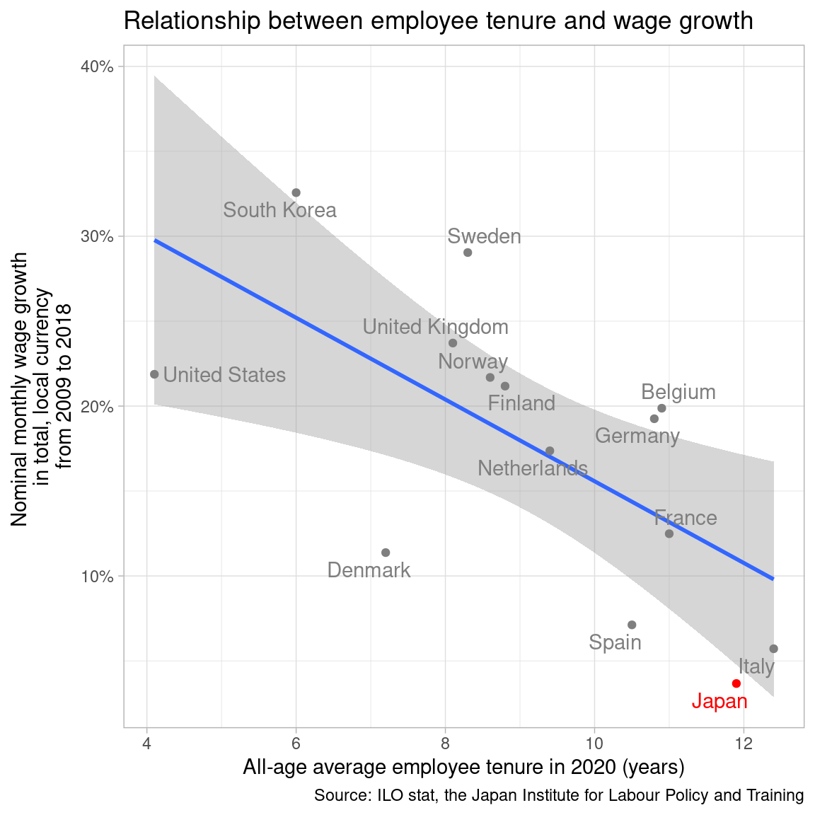
All-age average becomes longer in the highly aged country like Japan. I change x-axis as tenure at age 55-64. I also exclude South Korea, as its development stage is different from others.
dat_monthly2 |>
  filter(ref_area != "KOR") |>
  draw_scatterplot(tenure_55_64, growth) +
  labs(x = "Age 55-64 employee tenure in 2020 (years)",
       y = "Nominal monthly wage growth \nin total, local currency\nfrom 2009 to 2018",
       title = "Relationship between employee tenure and wage growth",
       caption = "Source: ILO stat, the Japan Institute for Labour Policy and Training")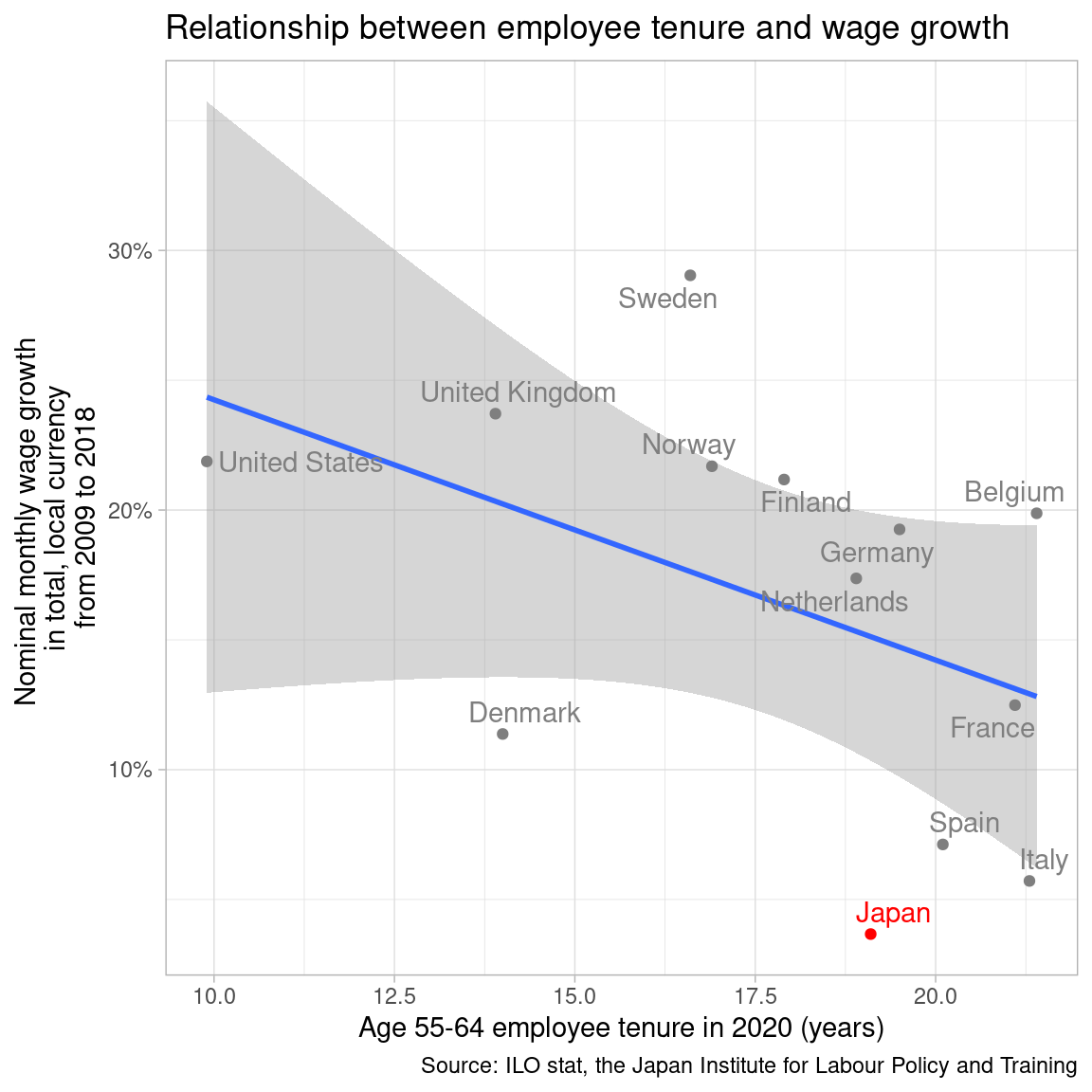
Still, I can’t say long employee tenure hurts wage growth from the above plot. As for y-axis, nominal wage reflects inflation, thus does not mean well-being.
inflation <- read_csv("data/OECD.SDD.TPS,DSD_PRICES@DF_PRICES_HICP,1.0+.A.HICP.CPI.PA._T.N.GY.csv") |>
  janitor::clean_names() |>
  select(ref_area, time_period, obs_value) |>
  mutate(ratio = (obs_value + 100) / 100) |>
  group_by(ref_area) |>
  mutate(
    ratio = if_else(time_period == 2009, 1, ratio),
    index = cumprod(ratio)
    ) |>
  ungroup() |>
  select(ref_area, time_period, index)
Rows: 450 Columns: 34
── Column specification ────────────────────────────────────────────────────────
Delimiter: ","
chr (23): STRUCTURE, STRUCTURE_ID, STRUCTURE_NAME, ACTION, REF_AREA, Referen...
dbl (3): TIME_PERIOD, OBS_VALUE, DECIMALS
lgl (8): Time period, Observation value, UNIT_MULT, Unit multiplier, BASE_P...
ℹ Use `spec()` to retrieve the full column specification for this data.
ℹ Specify the column types or set `show_col_types = FALSE` to quiet this message.inflation_jpn <- read_csv("data/cpi_jpn.csv")Rows: 54 Columns: 2
── Column specification ────────────────────────────────────────────────────────
Delimiter: ","
dbl (2): year, cpi
ℹ Use `spec()` to retrieve the full column specification for this data.
ℹ Specify the column types or set `show_col_types = FALSE` to quiet this message.inflation_jpn2 <- inflation_jpn |>
rename(time_period = year) |>
filter(between(time_period, 2009, 2018)) |>
mutate(
ref_area = "JPN",
index = cpi / cpi[1]
) |>
select(-cpi)
inflation <- bind_rows(inflation, inflation_jpn2)dat_monthly2 |>
filter(ref_area != "KOR") |>
left_join(inflation |> filter(time_period == 2018),
by = "ref_area") |>
mutate(real_growth = growth - index + 1) |>
draw_scatterplot(tenure_55_64, real_growth) +
labs(x = "Age 55-64 employee tenure in 2020 (years)",
y = "Real monthly wage growth \nin total, local currency\nfrom 2009 to 2018",
title = "Relationship between employee tenure and wage growth",
caption = "Source: ILO stat, the Japan Institute for Labour Policy and Training,\nOECD data (HICP) and Japan e-stat")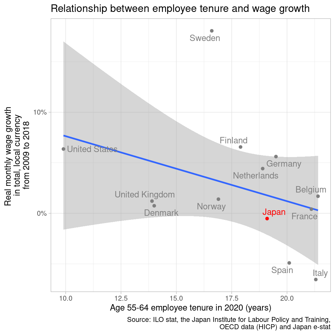
Also, monthly wage tends to be lower in the highly aged country, as old people work less hours in a month. I change y-axis as hourly wage growth.
dat_hourly <- Rilostat::get_ilostat(id = "EAR_4HRL_SEX_OCU_CUR_NB_A")Table EAR_4HRL_SEX_OCU_CUR_NB_A cached at /tmp/Rtmpb5FT0t/ilostat/indicator-EAR_4HRL_SEX_OCU_CUR_NB_A-code-raw-20240204T0718.rdsdat_hourly2 <- dat_hourly |>
filter(
ref_area %in% target_countries,
sex == "SEX_T",
classif1 == "OCU_SKILL_TOTAL",
classif2 == "CUR_TYPE_LCU"
) |>
select(ref_area, time, obs_value) |>
filter(
ref_area == "BEL" & time %in% c(2010, 2018) |
ref_area == "DEU" & time %in% c(2010, 2018) |
ref_area == "DNK" & time %in% c(2010, 2014) |
ref_area == "ESP" & time %in% c(2010, 2018) |
ref_area == "FIN" & time %in% c(2010, 2017) |
ref_area == "FRA" & time %in% c(2010, 2018) |
ref_area == "GBR" & time %in% c(2014, 2018) |
ref_area == "ITA" & time %in% c(2010, 2018) |
ref_area == "KOR" & time %in% c(2010, 2018) |
ref_area == "NLD" & time %in% c(2014, 2018) |
ref_area == "NOR" & time %in% c(2010, 2014) |
ref_area == "SWE" & time %in% c(2015, 2018) |
ref_area == "USA" & time %in% c(2010, 2018)
) |>
mutate(time = as.integer(time)) |>
# https://www.jil.go.jp/kokunai/statistics/databook/2023/05/d2023_5T-01.pdf
bind_rows(tibble(ref_area = "JPN", time = c(2010, 2018),
obs_value = c(2246, 2401))) |>
left_join(inflation,
by = join_by(ref_area, time == time_period)) |>
mutate(real_wage = obs_value / index) |>
arrange(ref_area, time) |>
group_by(ref_area) |>
mutate(
growth = (real_wage / lag(real_wage))^(1/(time - lag(time))) - 1
) |>
ungroup() |>
filter(!is.na(growth)) |>
mutate(
country = countrycode::countrycode(ref_area, origin = "iso3c", destination = "country.name")
) |>
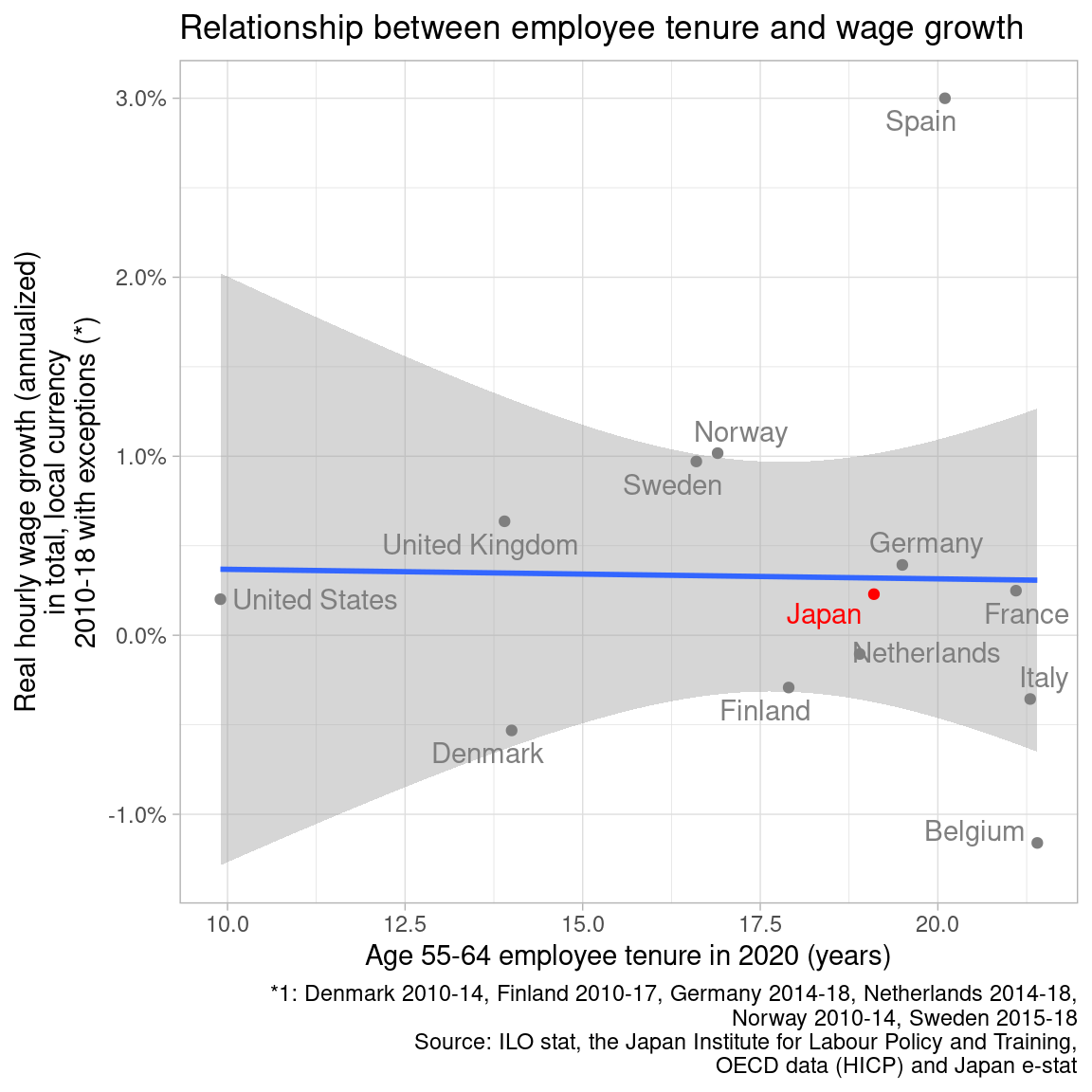
left_join(employee_tenure, by = "ref_area")Now, the fitted line is flat, as negative relationship disappears. Japan locates in the middle in y-axis. However, I am a bit skeptical about hourly data, as they don’t match well with monthly data, especially in Sweden and Spain.
dat_hourly2 |>
  draw_scatterplot(tenure_55_64, growth) +
  labs(x = "Age 55-64 employee tenure in 2020 (years)",
       y = "Real hourly wage growth (annualized)\nin total, local currency\n2010-18 with exceptions (*)",
       title = "Relationship between employee tenure and wage growth",
       caption = "*1: Denmark 2010-14, Finland 2010-17, Germany 2014-18, Netherlands 2014-18,\nNorway 2010-14, Sweden 2015-18\nSource: ILO stat, the Japan Institute for Labour Policy and Training,\nOECD data (HICP) and Japan e-stat")